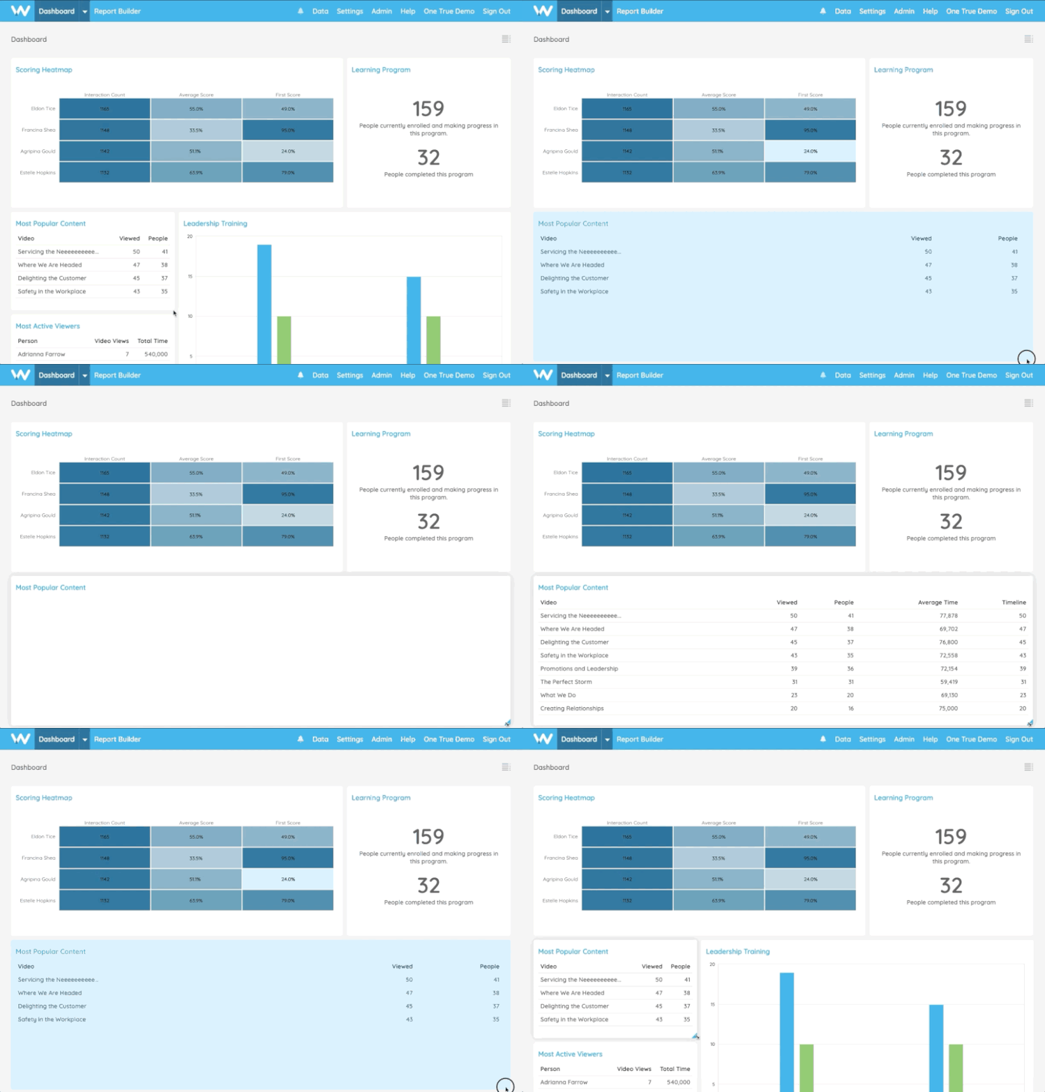
We’re excited to announce the latest Watershed features coming out this month—including fully resizable reports, improved dashboard report display, the new Metric Report, and performance enhancements.
Watershed Dashboard Upgrades
Earlier this year, we introduced an updated look and feel for Watershed with the goal of helping you better tell stories with your data. We’ve received extremely positive feedback from these changes as well as some additional requests for upgrades.
This month, we’re excited to release our second round of User Interface upgrades.
Fully Resizable Reports
With January’s release, we added the ability to horizontally resize reports on dashboards. With this month’s release, you can vertically resize reports, too! We’ve also added more grid options for resizing reports, so you’ll have more flexibility to rearrange reports.
And you can create white space on your dashboard without automatic report reorganization (a.k.a. the Watershed Shuffle).

Recommended Reading
Heatmap & Leaderboard Display
On dashboards, Heatmaps and Leaderboards now show more detailed data instead of summary views. For Heatmap reports, you’ll see a graded chart instead of average values.
And for Leaderboard reports, instead of seeing just one measure, you can resize these reports to view additional measures.

Resizing a leaderboard to show more measures on a dashboard.
Recommended Reading
Metric Report: Tell stories with your L&D data
The new Metric Report allows you to highlight a metric—such as a specific KPI or other key measure—on a dashboard so you can easily tell stories with your data. Choose a measure, and users viewing that dashboard will see that measure’s most recent value.
You also can use this report to create and display text boxes on your dashboards, giving you the ability to provide context to your data.
Metric reports on a sales dashboard highlight important metrics.
Recommended Reading
Watershed performance upgrades
We’re constantly working to improve the load time for Watershed’s data sets and reports. In order to quicken load times, we’re showing estimated values for certain measure aggregations (DISTINCT COUNT and SET).
By default, aggregation values 1,000 and below will be the actual values, and numbers more than 1,000 will be within 1 to 3% of the actual values. This default value can be raised to 10,000 in Advanced Configuration.
A message appears at the bottom of reports to let users know they’re seeing estimated values for some measures.
Recommended Reading
About the author
Brooks Alford is a tenured client success and operations leader who helps companies make innovative and complex technology accessible to all.
Subscribe to our blog