Numbers tell stories, but how do you help trends in the data shine through? That's where line charts come in.
They change raw data into visual narratives that can inform, persuade, and inspire action in Learning and Development (L&D). Now, let's talk about how line charts can enhance your L&D insights and inform strategic decisions.
Understanding line and area charts in L&D
In the L&D toolkit, line and area charts are true workhorses. They can help you visualize learner progress, tracking how skills or knowledge improve over the duration of a training program.
They're perfect for monitoring engagement metrics, giving you a clear picture of how learners interact with your platforms or specific courses over time. And when it comes to budget allocation and spending, line charts can reveal patterns that might otherwise go unnoticed, helping you make informed decisions about resource allocation.
At their core, line charts connect data points to show how values change over time. Their close cousins, area charts, take this a step further by filling the area beneath the line, emphasizing cumulative totals or proportions.
Both chart types are built on a foundation of x-axes (typically representing time), y-axes (showing measured values), and the all-important data points and connecting lines that bring your data to life.
Recommended Reading
The ups and downs of line chart anatomy
When it comes to choosing between line and area charts, context is key. Line charts excel at tracking trends over time, such as monthly course completion rates or daily active users in your learning management system (LMS).
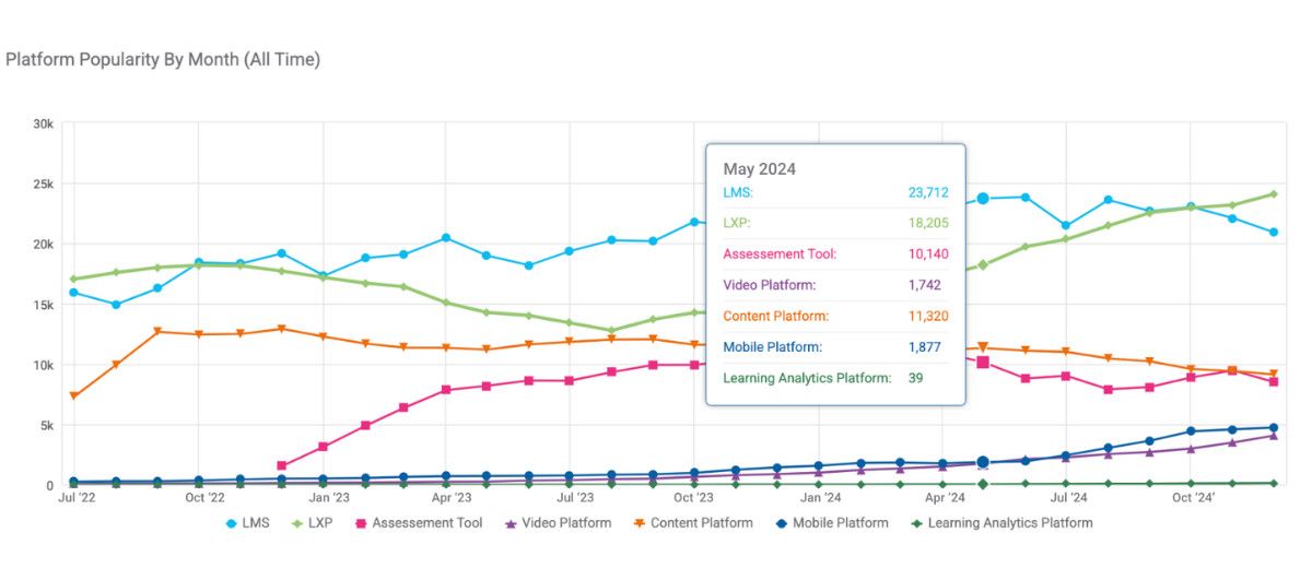
Line charts are great for comparing multiple data series, like different departments' training progress or platform usage.
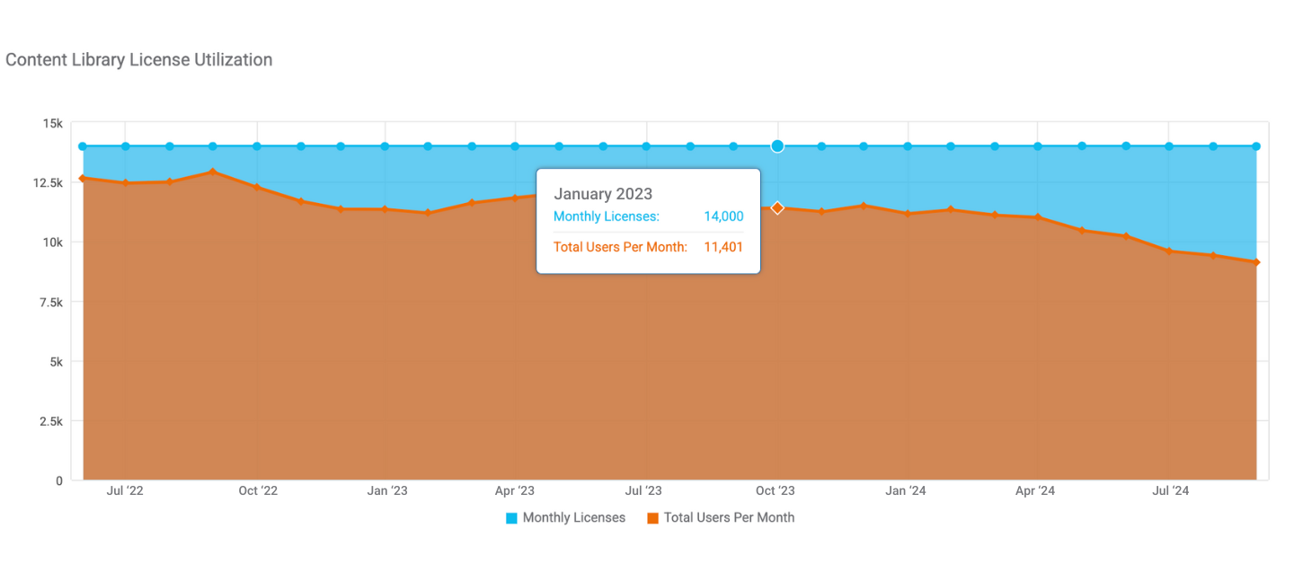
Area charts, on the other hand, shine when showing cumulative totals or visualizing part-to-whole relationships over time. Think total training hours accumulated over a year or the proportion of budget spent on different training types throughout the year.
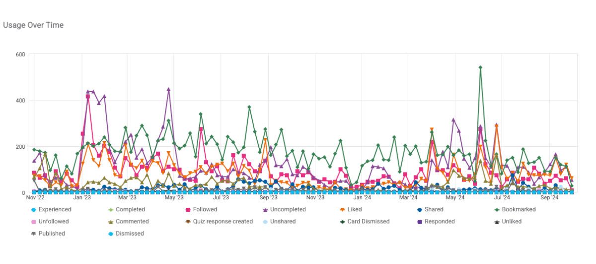
Of course, every tool has its limitations. Line charts can become overwhelming if you try to include too many data series (i.e., your chart shouldn't resemble a bowl of spaghetti).
Best practices for creating effective line charts
Creating effective line and area charts is more than just plotting points and connecting them. It requires careful consideration:
- Start by choosing appropriate scales and intervals. Ensure your y-axis starts at zero unless you have a compelling reason not to, as improper scaling can lead to misrepresentation of data.
- Use colors and patterns wisely, sticking to a cohesive scheme that guides the eye to key information.
- When dealing with multiple data series, resist the temptation to cram too much into one chart.
- Limit yourself to 3 to 5 lines per chart to maintain clarity and avoid confusion.
- And when using area charts, clarify whether your data is cumulative or non-cumulative to avoid confusion.
Beyond the flat line: Spicing up your training reports
While line charts are powerful in their simplicity, don't be afraid to explore variations. Here are some options to consider:
- Multi-line charts for comparing trends across different metrics or groups
- Stacked area charts for showing how different components contribute to a total over time
To take your line charts from good to great, consider adding some enhancements. Data markers can draw attention to key points, while annotations provide context directly on the chart.
If you're working with digital platforms, interactive hover effects can offer detailed information on demand, allowing users to explore the data more deeply.

Charting a path for all: Making line graphs accessible
As with all data visualization, accessibility should be a top priority. Use a colorblind-friendly palette and ensure your line charts use high color contrast between lines and the background.
Use alternative text descriptions for screen readers, and in area charts, consider using patterns in addition to colors to differentiate areas. These small steps can make your charts more inclusive and understandable for all users.
Recommended Reading
Bringing L&D data to life with line charts
Let's look at how line charts make a difference in real L&D scenarios.
A tech company uses a multi-line chart to track digital acumen badges earned over time across various skill categories. This approach allows their L&D team to quickly identify which digital competencies were gaining traction and where skill gaps persisted.
By analyzing the peaks and troughs in badge earnings, they can pinpoint the most effective training initiatives and refine their digital upskilling strategy.

A multinational corporation uses a multi-line chart to visualize hours across different learning tracks across their global campus. The L&D team can assess engagement levels across various programs and identify trends.
By tracking long-term patterns in areas like Corporate University, Leadership, and Business & Methods, they can anticipate future learning needs and allocate resources more effectively.

A customer-centric organization employs a dual-line chart to compare satisfaction ratings between employees who attended onboarding sessions and those who didn't.
Their L&D team can quantify the impact of their onboarding program on employee satisfaction over time. By identifying the consistent gap between the two groups, they can justify further investment in onboarding initiatives and develop targeted strategies to support non-attendees.

Up Next: Going full circle with pie charts in L&D
Line and area charts are more than just pretty pictures—they're powerful tools for visualizing trends and patterns in your L&D data. They excel at showing change over time, making them ideal for tracking progress, engagement, and the long-term impact of learning initiatives.
As you create your charts, remember to keep them clean and focused on the story you want to tell. Choose the right type of line chart for your data, use color and annotations wisely, and always consider your audience.
As you continue your data visualization journey, don't be afraid to experiment with different types of line charts. See which resonate best with your stakeholders and practice using these powerful tools to showcase the impact of your L&D initiatives.
Remember, effective data visualization isn't about creating the most complex or flashy charts. It's about clearly communicating insights that drive action and improvement in your L&D programs.
So go ahead, give line charts a try. You might be surprised at the stories your data has to tell. And stay tuned for our next blog post that covers all things pie charts!
About the author

As part of the Marketing team, Abbey is dedicated to managing our brand and overseeing our marketing communications, just to name a few.
Subscribe to our blog
